Air and Space Museum Companion App

The Challenge

The Smithsonian’s National Air and Space Museum wants to set itself apart by creating an innovative and interactive mobile experience for its visitors. The museum is so expansive that a visitor can hardly tour all of the exhibits in one trip. There are also so many visitors at once, that visitors need a clear direction and intention when starting a visit or it can be difficult to navigate. The app my team and I designed, will provide visitors with a unique experience by giving them new ways to learn and interact with the exhibits through Augmented Reality and Beacon Technology. In addition to an endless amount of activities and knowledge in the palm of their hands, visitors will have the ability to create custom itineraries and find a clear way to navigate to their exhibits of interest. This app will make their time at the museum more efficient and fun.
The Process
Research.
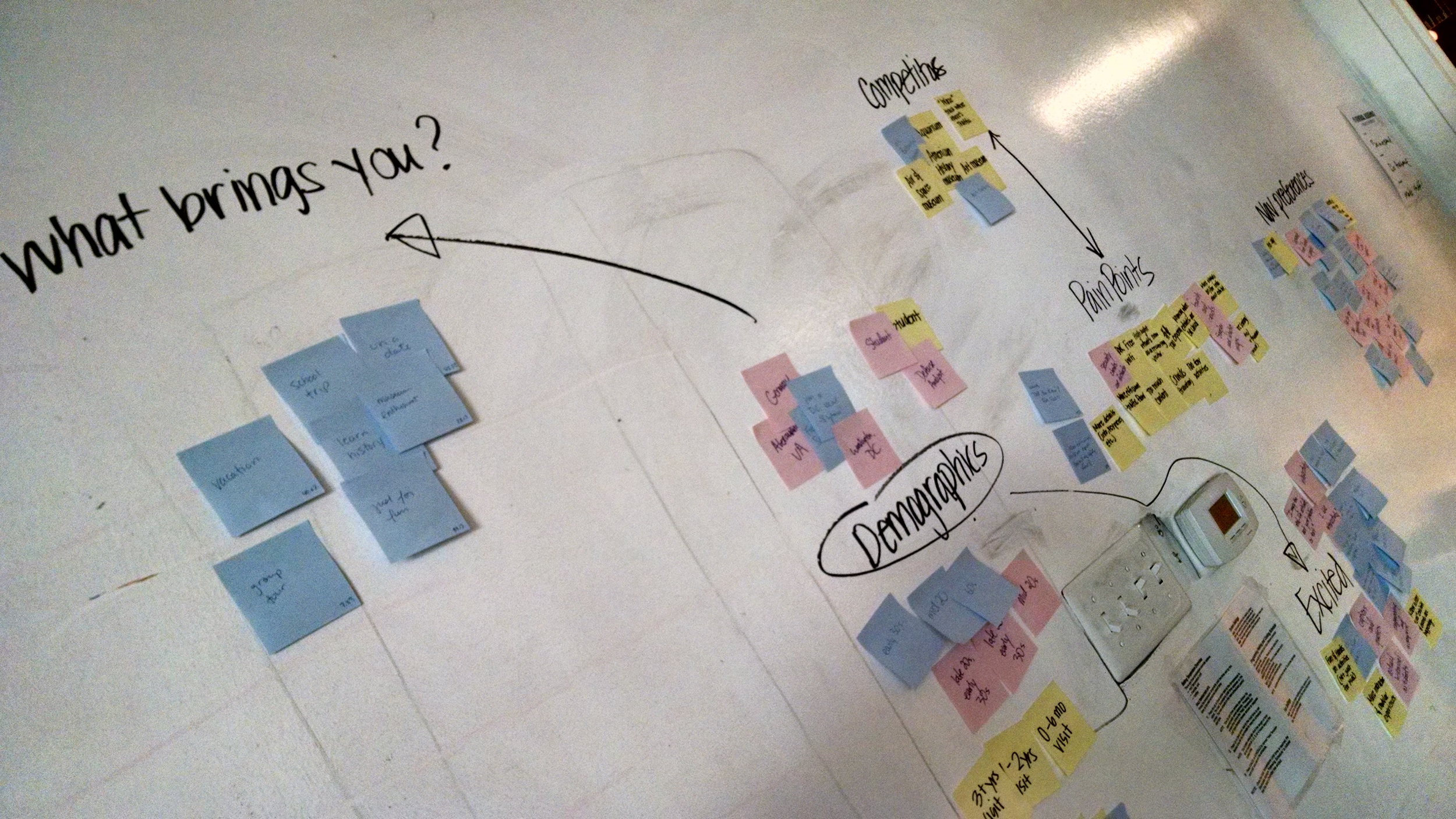
Who visits the museum? My team and I started off by looking at people who visited the museum.
Survey.
First we came up with a survey to help us understand who our users are and why they are visiting the museum. Once we saw the majority of our users were visiting specific exhibits, we wanted to know how they went about navigating to them.
We quickly realized that with most people preferring to explore on their own, we needed more information to get the “why”.
User Interview
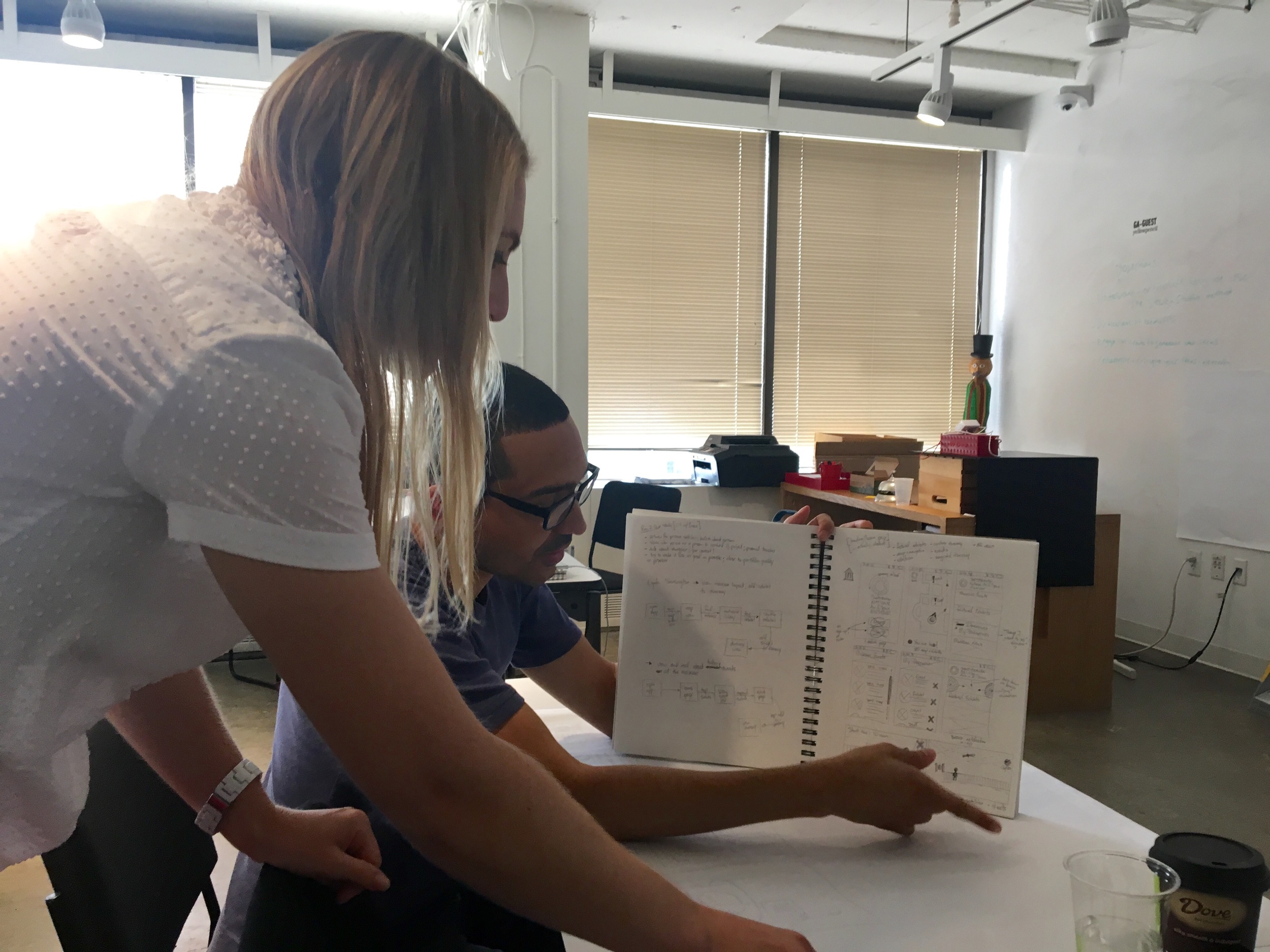
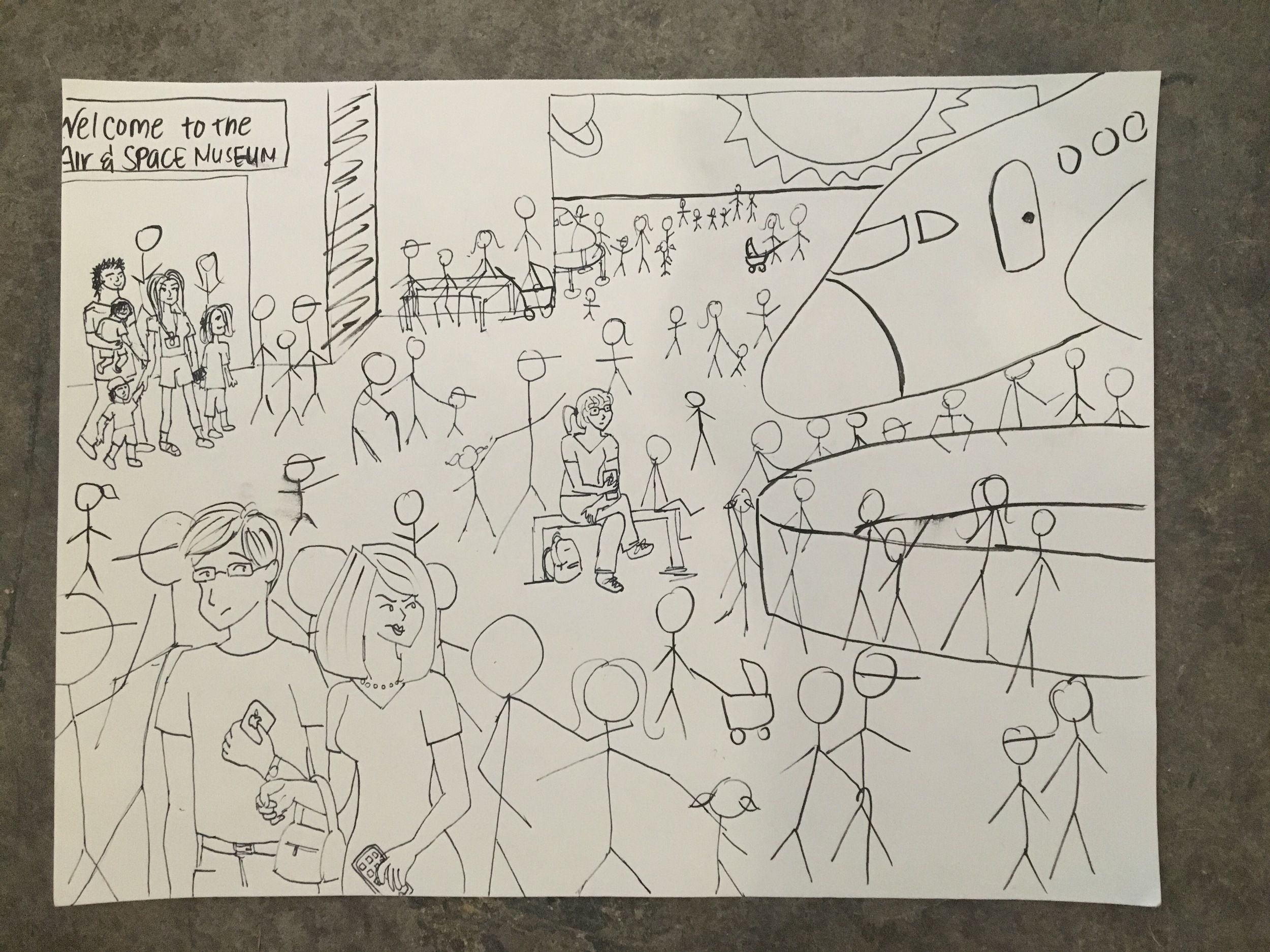
We then created questions to conduct user interviews, and once we had a set of questions we visited a local museum to find pain points actual museum goers had. I soon realized that this was harder than anticipated. The one family I interviewed were visiting the DC area for only one day and were in a hurry to get everything in. To top it off, they didn’t speak English fluently, which made it difficult to not ask them leading questions. Luckily, I did end up getting some useful insight to bring back to the team. Time was of the essence for my museum goers, and they wished there was an efficient route to go through an exhibit quickly and learn about them along the way.
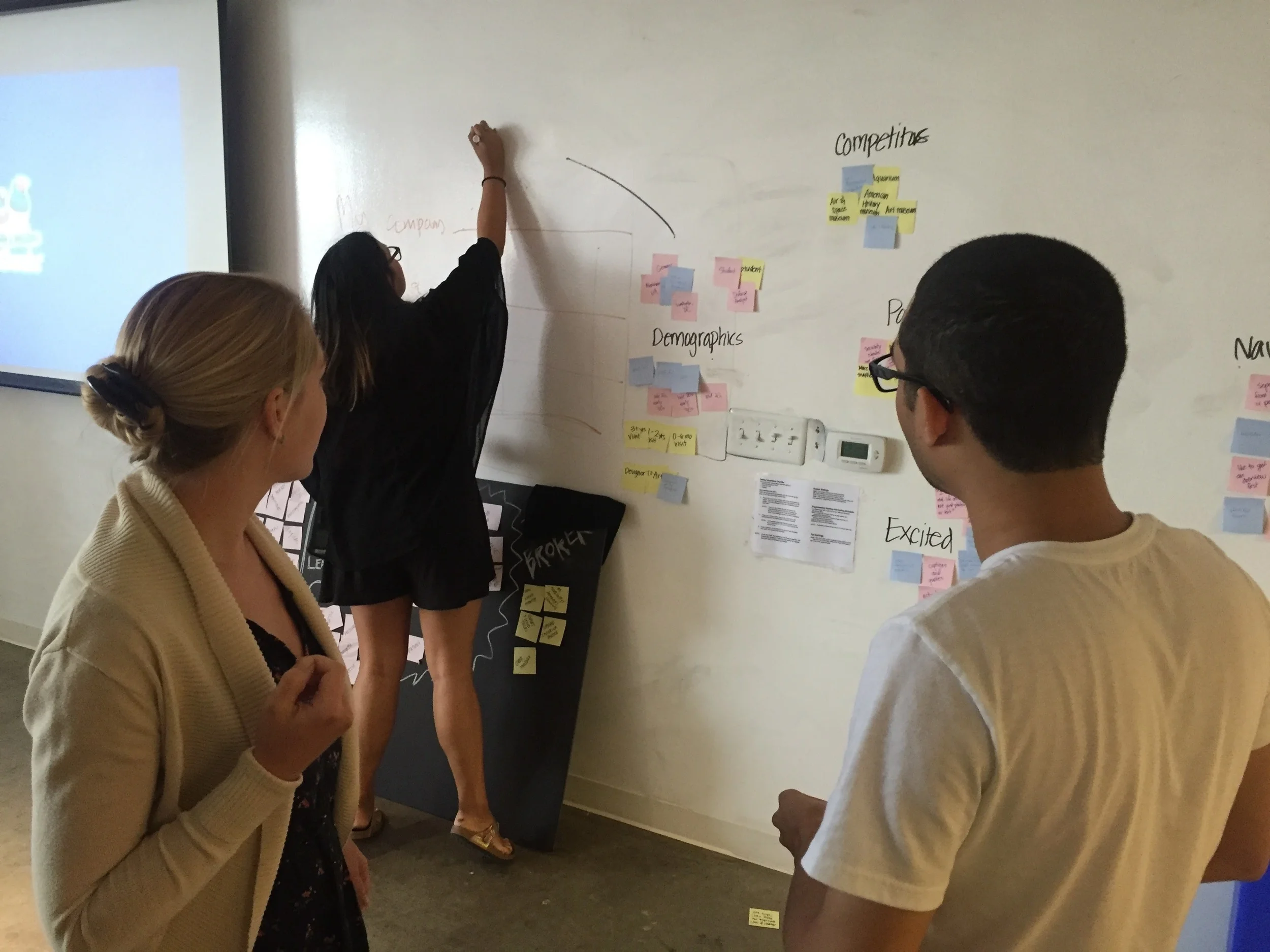
Affinity Map
Next, our team of three compiled our findings together and looked at the different people we interviewed. How were we to come up with an app for all these different visitors?

Affinity map session
By creating an affinity map, we were able to find a pattern which helped us create three personas.
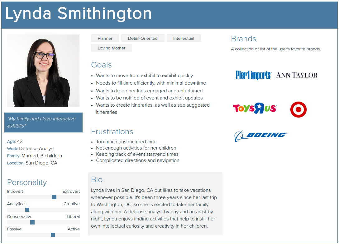
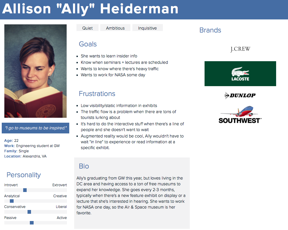
Personas
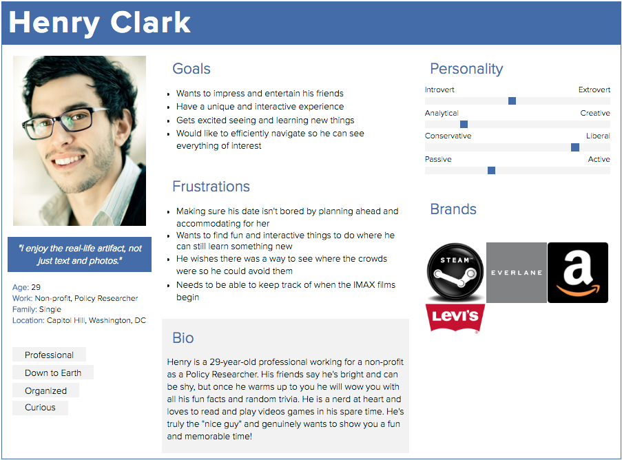
Each persona had a pain point we wanted to address, but one stood out to us most. Lynda, a mom of three who wants to keep her kids engaged but also wants to plan ahead with an itinerary. Then with the help of competitive analysis we were able to narrow down key features to help Lynda and her family out.
Design, Test, Iterate.
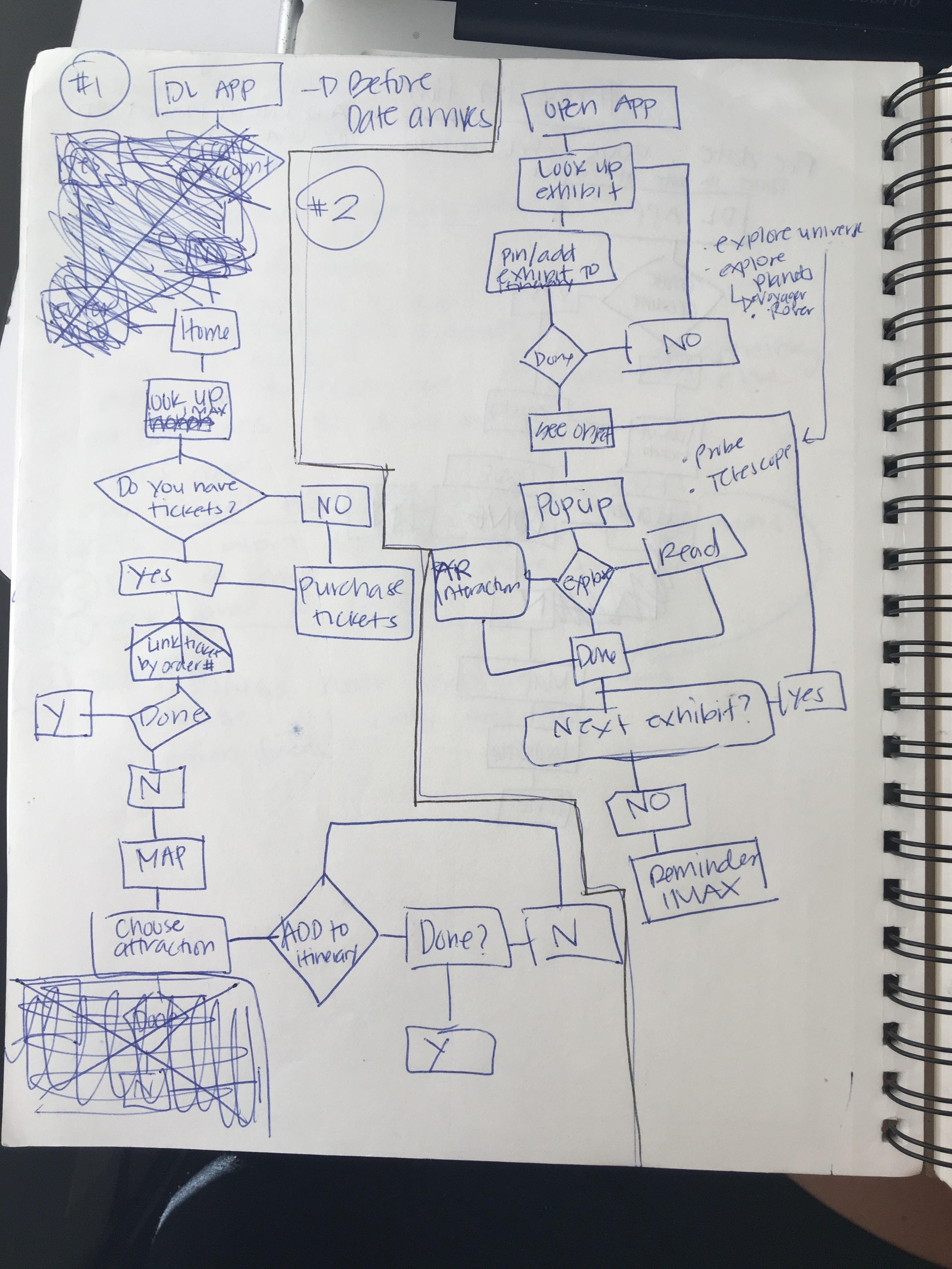
User Flow
After deciding we wanted Lynda to be able to create a customizable itinerary, we wanted to include ways to get her family engaged and immersed in their museum experience. We wanted to focus on learnability, discoverability and enjoyment.
This is where we decided that we wanted to include AR and Beacon technology. We had a lot of great ideas, but soon we began to lose sight of our scope. Our ideas began to take over, and our group felt we needed to design everything. I believe this is what hurt us most. Her user flow was quite helpful in determining what her visit may look like, but as you can see there are many features.
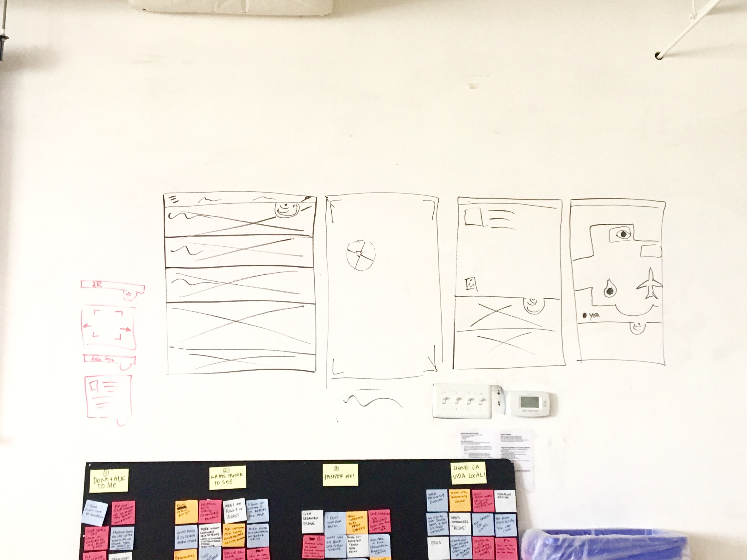
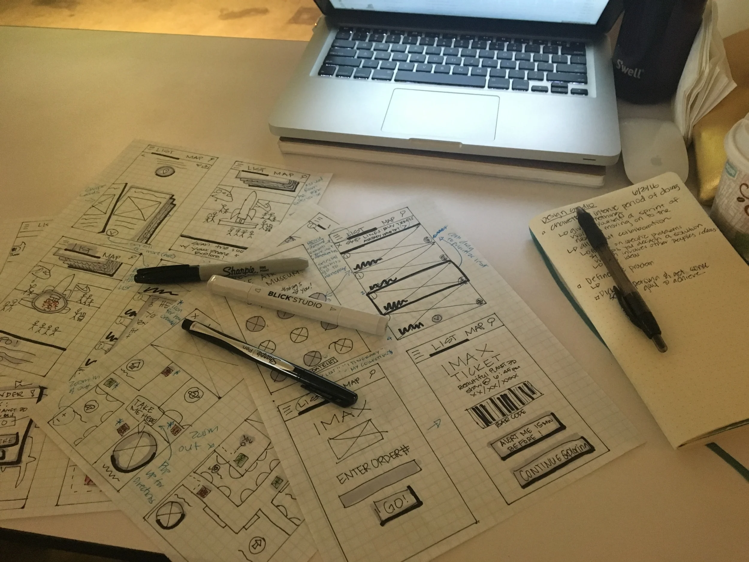
Wireframe, Test, Iterate
The first iteration of the beacon pop up didn’t test well with users. They thought it was too intrusive. They much preferred the second iteration, where the beacon notification was subtly displayed at the top. One thing they noted was it was easy to miss, and they weren’t sure how to get rid of it. Our final iteration included the beacon popup sliding down from the top, in front of the Nav bar. To engage with the beacon the user would swipe down, and to dismiss they would simply do the opposite and swipe down.
Much like the beacon, we tested the first iteration of our Augmented Reality experience. Our users thought it was great idea to see the AR overlaid on top of real life. However, they did not like the “Info” icons, and thought it was too much work clicking on them to see the AR. The users liked that they could just lift their phone and pan around to see AR interaction.
Finally the AR Navigation. One of our team members pushed for this specific feature. Though, I thought it was unnecessary and didn’t bring much value to the app or the users, I went along anyway. Users are able to select “AR Nav” from their map view, and the AR Nav will take them to the next exhibit of interest.
Prototype
Check out the Air and Space Museum Companion App prototype which shows you how to customize your itinerary and explore the museum using augmented realty and beacon technology.
Click through the Air and Space Companion via through InVision.
Future Forward and Takeaways
Though I believe our team did a great job with creating this immersive mobile app, I do think it could have been tremendously better. I didn’t stop and take a step back to assess what we were doing. If I had spoken up and said we should rethink a few things, I believe we could have honed in on one specific feature and made it great. Instead, we ended up creating a bloated app with features that probably aren’t needed. If I could go back and redo this again, I would definitely raise my hand more. I would listen to my intuition and frame my opinions in a way that is constructive and useful.
Another thing I would most definitely change is identify our roles and expectation as a group, and most importantly as individuals. We ended up doing everything together most of the the way, which didn’t do anything for us. We had great time management and teamwork, but we were lacking in individuality. We did not bring our strengths to the table enough.